Summary
Goal:
To design an automated call/messaging test app for Android to schedule hands-off auto calls in the office or when phone location changes.
Problems:
- Test engineers needed to run call/messaging tests when driving, but the law prohibits using phones when driving. A user-friendly design was needed for the current Android app to enable automatic calls/messages when phone location changes with certain velocity.
- Engineers had problems setting up tests correctly on the current app, which led to a high (20%) error rate.
- The current app was difficult to learn for new engineers, which cost time for both the lead engineer and contractors.
My role:
I am the only UXer in the team. My end goal was to design the app that met the driving safety and privacy requirements, and provided the best UX to save onboard time for engineers.
Deliverable:
- Created an Android phone app design that developers can deliver in a limited timeline.
- Reduced onboarding time by 80% since the app was intuitive to use.
- Increase satisfaction score from 3.5 out of 7 (from the original app) to 6.2.
- Decreased test setup error rate from 20% to 1%.
Story
An app to promote work efficiency
Test Automation team used an app to test out call/messaging ability of phones when phone location changed. In order to carry out the study, they would need two engineers: one drove while the other one was testing on the phone. In order to have only one engineer for each test, Automation test team wanted to develop a new app to start auto calls/messagings when phone location changes with certain velocity.
The testing app they used at that time required a lot of training to new engineers. The Test Automation team wanted an app that was easy to use, ideally, no training would be needed for new engineers.
Gather requirements and learn from the existing app
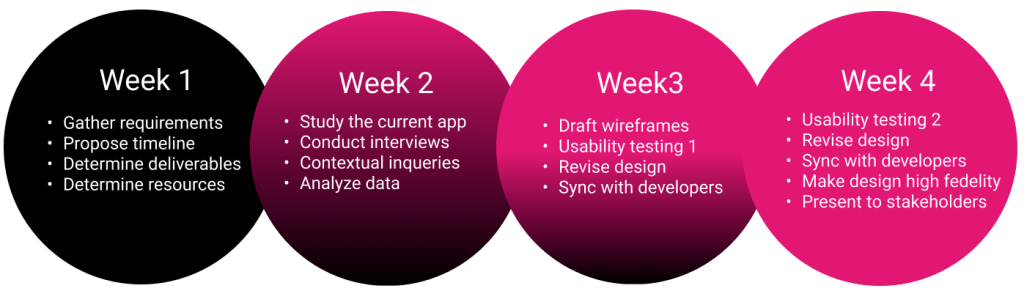
During the first meeting, we determined timeline and resources. After discussion, I found I had time for research and rapid usability testing. The following was the timeline I proposed to stakeholders:
Preliminary research
Study the current app:
Test Automation team shown me their current testing app. One test lead explained to me every function of the app. She prioritized their importance and explained her expectation of how those features should help her daily work. The current app had important features including in office test automation and also driving test automation. However, during initial meeting people put emphasize on the driving one but not the in office functionality since it worked fine if set up correctly.
Interviews and contextual inqueries:
With the lead engineer’s help, I had the chance to do research with 8 field engineers. I hopped on field engineers’ cars and did a quick field research and interviews after we were done driving. I observed how they use the current app and conducted interviews with field engineers to learn about pros and cons of the current app. These users told me the most critical user pain point that I had to solve: learn to set up the app and set it up correctly before starting the test was difficult for some reason. Most contractors moved from team to team. Both lead engineers and contract engineers feel they spent too much time onboarding since the current app is somehow complicated. Moreover, they found they somehow would not be able to set all devices right before testing. They would like to reduce the error rate to the minimum.
Preliminary research helped me to persuade stakeholders for the app UI redesign. The current app was rated 3.5 out of 7 in satisfaction. It meant redesign the current app UI was a must. After seeing the satisfaction score, stakeholders gladly accept my proposal to have the entire app UI redesigned.
Personas
After my preliminary research, I created personas according to data I gathered. There were two main personas as our users: Sarav, the primary persona, and Ann, the secondary persona:

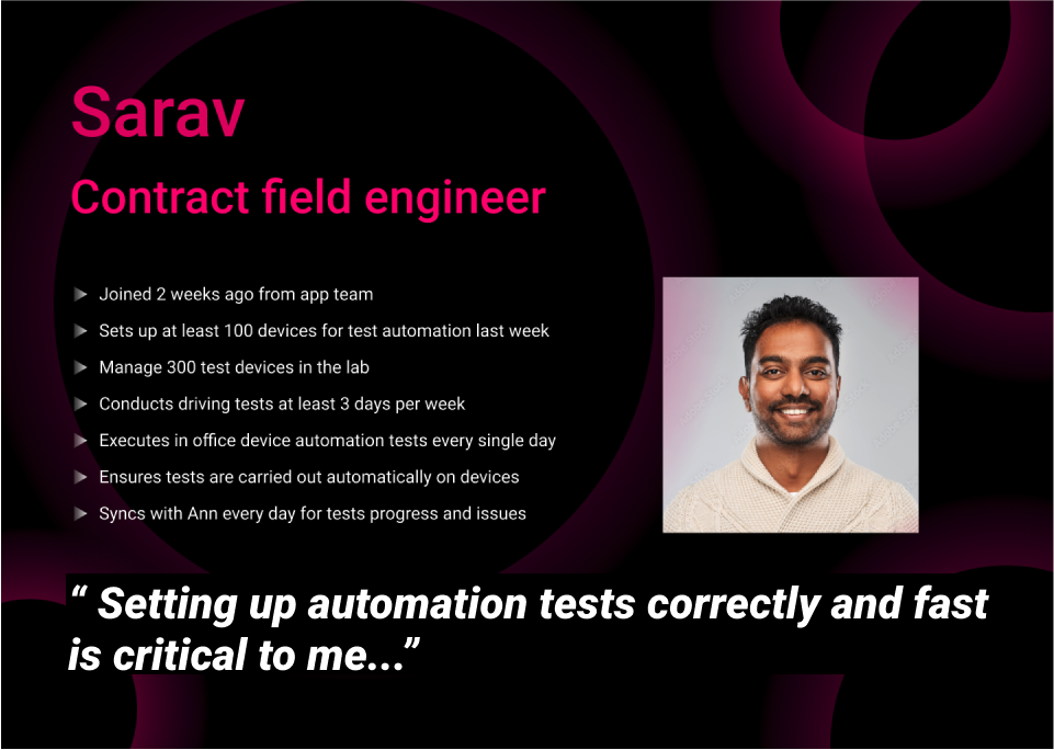
In the description, I listed up user pain points, expectations and goals for this app. Personas helped to remind myself of user needs and wants clearly during the following busy iterations.
Information architecture
Information architecture helps me to organize layers of this application. From my research, I determined user goals and the most important functions for users to reach their goals. The project lead found it inspiring, and was very useful to enhance discussion in meetings.
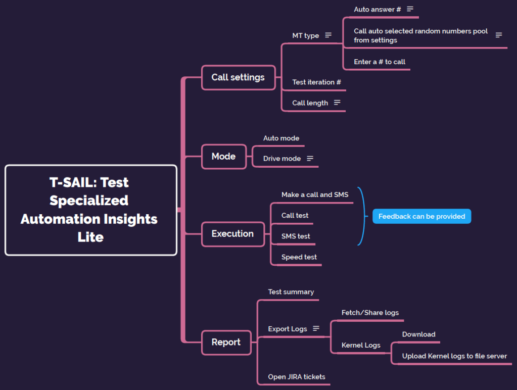
I enjoy draw this kind of chart to support discussions with stakeholders/clients. Visualizing information always helps people to understand user goals and generate new ideas even to solve problems.
In our discussion, we revised this information architecture chart till we all thought the app will serve our goals. That is, as a designer, the chart would help me to determine the interaction. For developers and stakeholders, it could be developed in the limited time frame using limited resources even in the backend. Once we determined this chart serves the our common goals, I started to draft the design and map up the flow.
Draft up designs with some fidelity
According to the research, the most critical function was to help the user correctly set up call/messaging test according to lead engineers’ specific requirements. I decided to dedicate the home page to test configurations that users could customize settings right away after entering the app. Besides, the user could change any item right after a test iteration and start a new set of tests.


The three major navigation bottom below are for the user to start testing right away. After a series discussion with test engineers, I ensure the default settings are most commonly used setup by our users. That is, in most situations, the user won’t need to change anything and can tap the button in navigation bar to start the auto test flow.
After I drafted designs, I had discussion with developers to see if the backend can support features in my design. Providing the draft created efficient discussion to determine what to change or not. Developers appreciated my sync sessions after new designs so we avoided what they mentioned “unrealistic designs that can not be carried out”.
2 usability testings with rapid iterations
The most exciting moment came when I test out my design with field engineers in the car! Engineers loved my design and gave me very helpful comments for revision. During these 2 iterations, I synced with developers for possible solutions to solve possible obstacles users encountered. Engaging developers when design could avoid problems in development after design phase ended.
I tested my design with 8 engineers in each testing. The satisfactory score was 6.2 out of 7 from the second testing. I was very happy to see the improvement from 3.5 which the original app received.
Presentation to the stakeholder, QA and add improvements
After developers and I reached agreement of the revised design, I presented my design to stakeholders. 2 months later, the lead engineer sent me the very first Android mvp apk build. It was a joyful moment, but I soon realized some details on the UI needed to be fixed. So I QA’d the app by opening up issues on JIRA and communicated with developers for fixes.
Later on during this period, the PM found a user privacy issue and wonder if there was an easy fix from the UI. After a discussion, I suggested a simple popup was created as OOBE can easily solve this issue instead of changing existing UI.
After the app was shipped, I met field engineers at work. They told me they love this app so much more than the one before. I felt so proud of what I have designed!
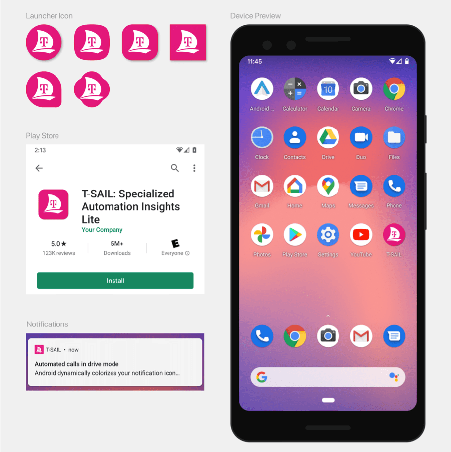
Unfortunately, I am not able to show more than the app home page since it is a T-Mobile internal application. If you are interested to know more about this app, please contact me for Zeplin link and more information.
Thank you for reading! Have a great one!

Leave a comment