Summary
The issue:
The Device Engineer team needed a design of a web portal where managers, PMs, test leads, and device manufacturer (OEM) engineers could input/retrieve data easily.
My role:
Since I was the only UX researcher/designer in this project, I was in charge of the research and design of this web portal. During the process, I worked with the PM and developers, and presented to the stakeholders.
Deliverable:
- A web-based portal design with multiple features for different types of users.
- An admin portal design for admin to determine which features are accessible to types of users according to user roles.
Story
The device engineer team would like to build up a web portal to handle all device testing related needs inside and outside of T-Mobile. The project manager told me it’s going to be “the only site” where all team members, managers, T-Mobile and OEM engineers to input/export device and tests related data. Currently engineers were using at least 5 different applications to check on testing progress and compose reports. Managers had to dig into these applications before they can send out certifications. The communication with device manufacturers and labs were mainly through emails. Engineers spent a lot of time to track all lab reports in emails, needed to look into different applications to figure out where they were in the device certification progress.
Understand the needs/ requirements/ resources
The stakeholders wanted a portal for engineers, manufacturers and managers to input/retrieve data, upload/download reports, check lab results and the certification status. They hoped to eliminate complicated communications and provided easy to view lab status for all users.
After the discussion with stakeholders to understand the scope of this project, the PM and I determined it was a user role based portal. Different features would be available depending on the user type after users log into the site. Thus, as a designer, I had to figure out which feature displays for which user roles and flows for the communication among these user roles.
Preliminary research
I interviewed 5 users from each user group, and understood menu items that they want to have on this portal. Since this was a role based design, understanding which items to show on menu was critical. Moreover, figuring out an appropriate item name was critical to me as well. I expected users could understand the menu right away right after they log into the portal without onboarding or learning.
These 15 users offered very helpful information on what they wish to see after they logged into the portal. Also they prioritized item orders and determined key features for me.
After user interviews, the PM and I did first card sort together to determine menu items for different user groups.

After we had basic understanding and determined the key items from the card sort, I did an online open card sort with 50 users to determine the name of the menu items, and the prioritization of features.
According to our findings, I created an information architecture chart quickly and presented to them in the next meeting. I found charts like this would promote clients’ feedback, enhance meeting discussions, and efficiency.
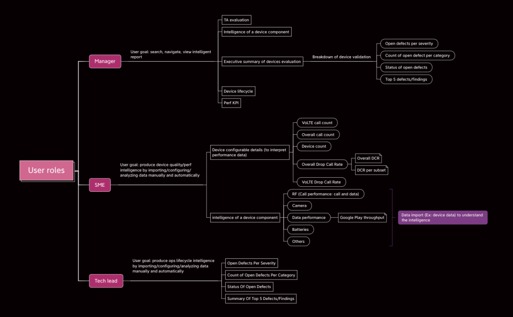
Stakeholders were glad to find this information architecture was similar to what they expected.
Draft the design
After defining what features to go into the portal with the team, I started design, and shown the PM, engineers, and stakeholders my draft and arranged additional meeting discussions. Stakeholders and engineers told me the early draft helped them to clear their thoughts and understand what they really want for the product.
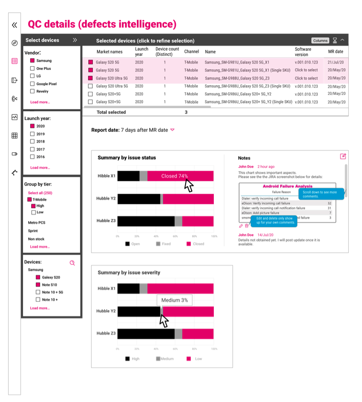
Here are some example pages of my design according to the style guide we had:
Manager would see this home page and menu after login since pulling out data was always their main goal.

For engineers, since to query, manage, and input data were their main user goals, I designed the menu/flow for easy file access and manage files.

For OEM engineers, the major task was to upload files. The design provided them shortcuts to their goal:

Moreover, search and filter were critical in this portal since there were a myriads of phone models and manufacturers (OEMs) in the database. The portal had to provide a convenient search and report summary display where the user can modify output data and compare. The old system engineers used since the 90s provide search function, but the interaction was very tricky to figure out. It would require some training to choose the right filter for new users. My goal was to enable users to have a smooth transition from the old system to the new one for existing users and eliminate trainings as much as possible for new users.
Therefore, the interaction of search and filter should be enhanced with smart search, but still have the “flavor” of the old system by mimicking the interaction and some design. By doing so, users can just use the new system without training or change their habits dramatically. After the portal went alive, engineers told me they liked the new portal. They said the new system was “prettier and smarter than the old one and more intuitive to use”. Some engineers had been using the old system since the 90s, but they did not feel awkward migrating to this new system at all.
I talked to my stakeholders and users about responsive design. Unfortunately the answer was
“not now” since it would cost extra development time and work. Working in the lab everyday, I understood most engineers had two huge monitors on their desk, but it was actually efficient to design/build something flexible from the beginning. Stakeholders thought it’s not the concern for now, at least at a time for migrating from the old system. The goal was to have a smooth transition from the old system to the new one with limited resources and tight timeline. I promised myself that I will bring it up in the future when we have a chance to revise the portal.
T-Mobile enterprise design style had changed since then, when I looked at it today, I felt the design was a little bit too bold and boxy, and outdated. I think a new visual design revision is needed if development resource is available. Again, we are busy working on new features, and visual design is not the priority right now according to the development team. My engineer users told me that they were fine with it since the usability is great. The process of design for me is a constant negotiation with stakeholders/clients and development team. My goal is to accomplish what they want with user friendly products, and to push on improvement if possible.
I can only share a few screens of the design in low fidelity since it is an internal project. Please email me (wenshufan at gmail) if you are interested in knowing more about the story of this design. Thank you for reading!

Leave a comment