Summary
Goal:
Ensure rapid design revisions happen efficiently and the developers can follow up with the change.
Problems:
- Rapid screen redesign is needed to match up the changing situation.
- Developers can not understand the flow by looking at individual screen design files and don’t have time to read documentation in the rapid iteration.
My role:
I am in charge of the app flow design and revision communication between developers and designers.
Deliverable:
- Provided ideas to designers on how to re-design and enhanced rapid iteration.
- Map up screens to illustrate the flow for developers for fast understanding of the screen flow. Devs found my map easy to use.
Story
To develop the “evolutionary app” under time pressure…
“It is one of the hottest project in T-Mobile…” my friend told me before I joined this project. “But it can be insane since no one has ever done it before…We are trying to create an app that will change everyone’s life in the future.” It sounds crazy, but it is what we are aiming for.
I was extremely excited to join this project, then realized that there were huge challenges. We need to experiment designs first because no one really know every aspect. There is not enough time for planning and communication. Even the architecture map was not quite complete and accurate. Then we check and see if the UI design can match up with changing APIs in the backend. Later we realized certain items had to work in certain way owing to telecommunication limitation (such as towers and devices etc.), rapid UI flow revisions were done while the app was in developing period owing to time constraints.
Rapid design revision by using existing design patterns
The UX team finished design under a short time without the luxury to get to understand every aspects of the backend functionalities (I don’t think there is one person understands everything since it is a humongous app). It is not unusual that requests would popup from another team (network, storage or legal team etc.) for revising the design to match what they can provide or regulations.
When this kind of requests come to me, I conduct competitive analysis on to see how other apps or the native OS solve similar interaction problems if applicable. I believe usually there is no need to reinventing the wheel (assuming that we are not the first one encounter similar design problems). We should use existing interaction patterns to solve complicated problems we face. Well, it depends on who you are working for. If a designer is working for an iconic application company where users are willing to learn new interaction from (EX: Apple, which forced their users to learn new behaviors on iPhone X and later models). Designers have the luxury to make their own new solutions (through a myriad of usability testings, I hope). Most designers should always keep ourselves exposed to the most recent updates and interaction design trend since reinventing the wheel is not necessary.
Since we are mainly doing design for mobile phones and tablets, understanding how the two major operation systems (iOS and Android) work is essential for me. Other than updating myself with newest design pattern through learning, luckily I have access to newest mobile devices all the time (Thanks to T-Mobile). Constantly I play with them to experience the newest interaction updates (such as iPhone X and XR, which employ very different design patterns from older iPhones). Anthropologists believe they should try to fully understand the environment even before studying their subjects. I believe UX designers should try our best to understand the environment even before we design.
Designers are extremely busy, so when I present designers problems and request for revision, I usually present my research results and suggestions at the same time. By providing information and suggestions to designers, I shortened the design revision time for our app.
Busy devs don’t like prototypes ( they said it’s too much work to use it…)
In this time crunch rapid sprints, we need to find an efficient way to communicate with developers (especially those off-shore ones) our expectation of the interaction and UI flows.
To enhance communication, the UX team tried prototyping with Axure in the beginning. However, the rapid changes sometimes reflected in UI elements can lead to a plethora of conditions. The team had to produce the instruction to explain interactions in the prototype. Later on, I found very few devs read these instructions, while only few devs played with the prototype. For those devs who used prototype, they did not see the subtle interaction embedded in the prototype that we hoped them to see. Most devs simply use screens posted on InVision and put them together in the build. Therefore, we found a lot of interaction missing or not according to design.
Another problem we faced was that, prototype can not efficiently reflect rapid UI elements change under time pressure. It will take a lot of time for the UX designer to replace single elements on every states, which we all think it is not worth it. When the team fail to update it rapidly, developers deemed the prototype not accurate and stop using them.
Devs love my flow maps
I found the most efficient way to communicate screen flows with devs is to create a flow map. Human beings are visual. That is why there is a famous saying that, “A picture worths more a thousand words.” I believe reading requires brain power, since there are a lot of evidence that reading can improve brain functionality. In our modern society, when there is too much to do but time resources is so scarce, human just simply do not want to spend the extra brain power to read. For example, I know a lot of people, including users I met in usability testing, do not read manual at all. It is just simply human nature to avoid reading.
Instruction of how to use a prototype is like a manual. Like most users, devs simply do not want to read them.
So I created a flow map by simply put screens together, and use arrows to point out where each actionable button should take the user to. If necessarily, I write briefly on how the interaction should look like.
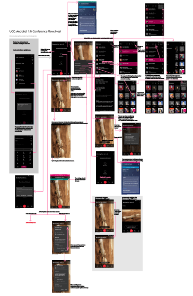
When an element changes in the flow (EX: a menu item) , I can simply update it in the flow map by drag items around or mask it. I write description on the changing verbiage or states if needed.
Devs told me how much they love this easy to understand map. They said the map eliminate their painful guesswork for developing a complicated application like this.
By using the flow map, I can point out important interactions, display, and explain design elements clearly like a documentation. I think the only difference between a documentation and a map is one is verbiage oriented, the other one is picture oriented. It is similar to a quick start manual that user can give a quick glance and understand how to assemble a product.
Therefore, to my delight, devs requested maps from me whenever a new sprint was about to start. I found the map serves as a great communication tool when everyone is under the sense of time pressure.

You must be logged in to post a comment.